
From licks to likes

Wall’s has been the taste of happiness since 1926. Sub-brands like Twister, Calippo and Solero have bags of personality, but the Masterbrand was mostly stuck on price boards. The love was there. The system to hold it together wasn’t.

So we brought the red and white Heartbrand into the modern era, with a social-first platform built for brand and buzz.
From licks to likes

Wall’s has been the taste of happiness since 1926. Sub-brands like Twister, Calippo and Solero have bags of personality, but the Masterbrand was mostly stuck on price boards. The love was there. The system to hold it together wasn’t.

So we brought the red and white Heartbrand into the modern era, with a social-first platform built for brand and buzz.

Full ‘Mad For’ mode

More than a flash in the feed, ‘Mad For’ became a new way for Wall’s to show up. The Heart already stood for love. ‘Mad For’ made that love feel alive – irrational, joyful, undeniable.

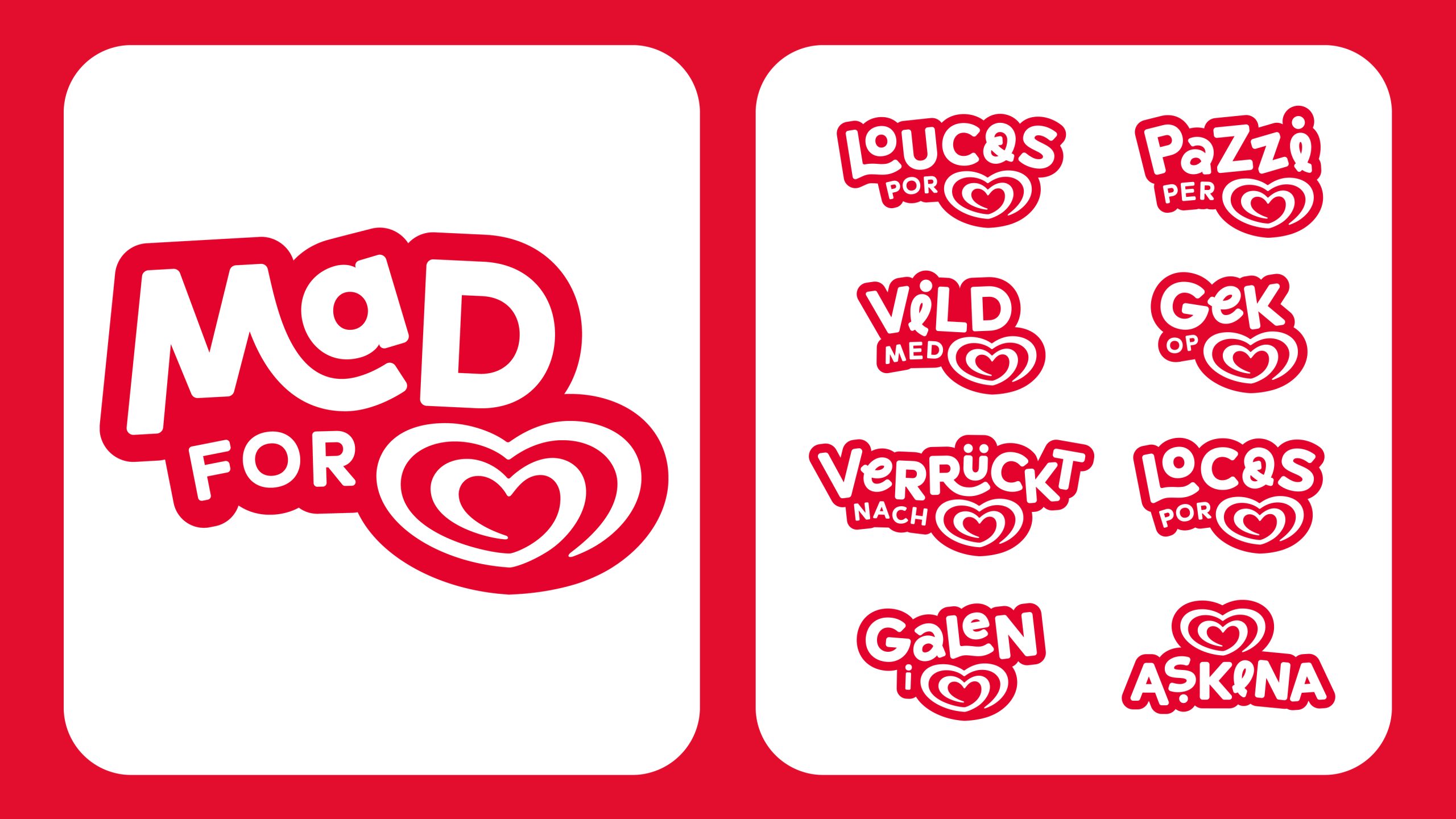
We built a system with two speeds: fixed equities to keep it recognisable and flexible tools to grab attention. A bold ‘Mad For’ lock-up flies the unmistakable Red & White flag, with a panel system framing products, people and moments for 40+ sub-brands.

Because love like this doesn’t sit neatly inside the box, ice cream drips, melts and oozes out. People break the frame. ‘Mad For’ a lick, a bite, for one more.

Licked into shape

Wall’s previous typeface was being copied by everyone. So we gave them one they could own. Confident, legible letterforms, with subtle script twists for a hit of ‘Mad For’ energy.

We also led the global shoot, capturing in the moment energy. Real people. Real reactions. Ice cream that looks as cold and creamy as the real deal. Giving the campaign a running start, we defined the distinct personality of 16 sub-brands.

Made ‘Mad.’ Done bright.

In a world where campaigns disappear in a scroll, this one was built to stick. Capturing the attention on the streets, in the feeds and in the hearts of a modern audience – all while strengthening Wall’s for the next era.